Flagship case study · End-to-end business intelligence
Where a bank's card value hides — and where fraud does
The brief
A Head of Cards at a mid-size retail bank has two levers and no map for either. Card growth targets are rising, fraud losses are rising with them, and complaints about payment friction are increasing. She needs to decide where to concentrate retention and upsell spend, and where to tighten fraud controls without punishing good customers.
I scoped the project from that decision, not from the dataset — writing a requirements brief with agreed KPIs and an explicit out-of-scope list before touching the data, then holding that scope.
Translating the question
"Customer value" is not a column. Neither is "risk". The mapping is where the analysis actually happens:
| Business concept | Modelled as | Reasoning |
|---|---|---|
| Customer value | Total spend per client + NTILE(10) decile rank | Cards are a volume business; concentration matters more than averages. |
| Fraud exposure | Dollars at risk, not incident counts | A count treats a $12 fraud and a $1,200 fraud as the same event. |
| Creditworthiness | Standard FICO bands | Recognisable to a risk team; not ranges I invented. |
| Channel | Chip / Swipe / Online | Card-present vs card-not-present is the core fraud distinction in payments. |
| Account tenure | Months to the dataset's last date | Data is frozen in 2019; ageing it against today would inflate every tenure. |
Deliberately excluded: card numbers and CVVs (sensitive-style fields, even in synthetic data), a field holding one identical value across all 6,146 rows (no signal), and geography below state level (out of scope by agreement).
The build
Ingest, clean & model
Ingest & clean: Python converts the JSON sources to CSV; one SQL staging layer does all type work at the boundary — currency strings to decimals, MM/YYYY strings to dates, and forced quote handling for a comma-joined error-code field that defeated the parser's auto-detection.
Model: a star schema in DuckDB — one 13.3M-row fact table at transaction grain, four dimensions, and all banding logic defined once in SQL so every downstream number shares a single definition.
Analyse & report
Analyse: window functions rank customers into spend deciles (NTILE), calculate recency, and compute running totals and a three-month moving average across all 13.3M rows.
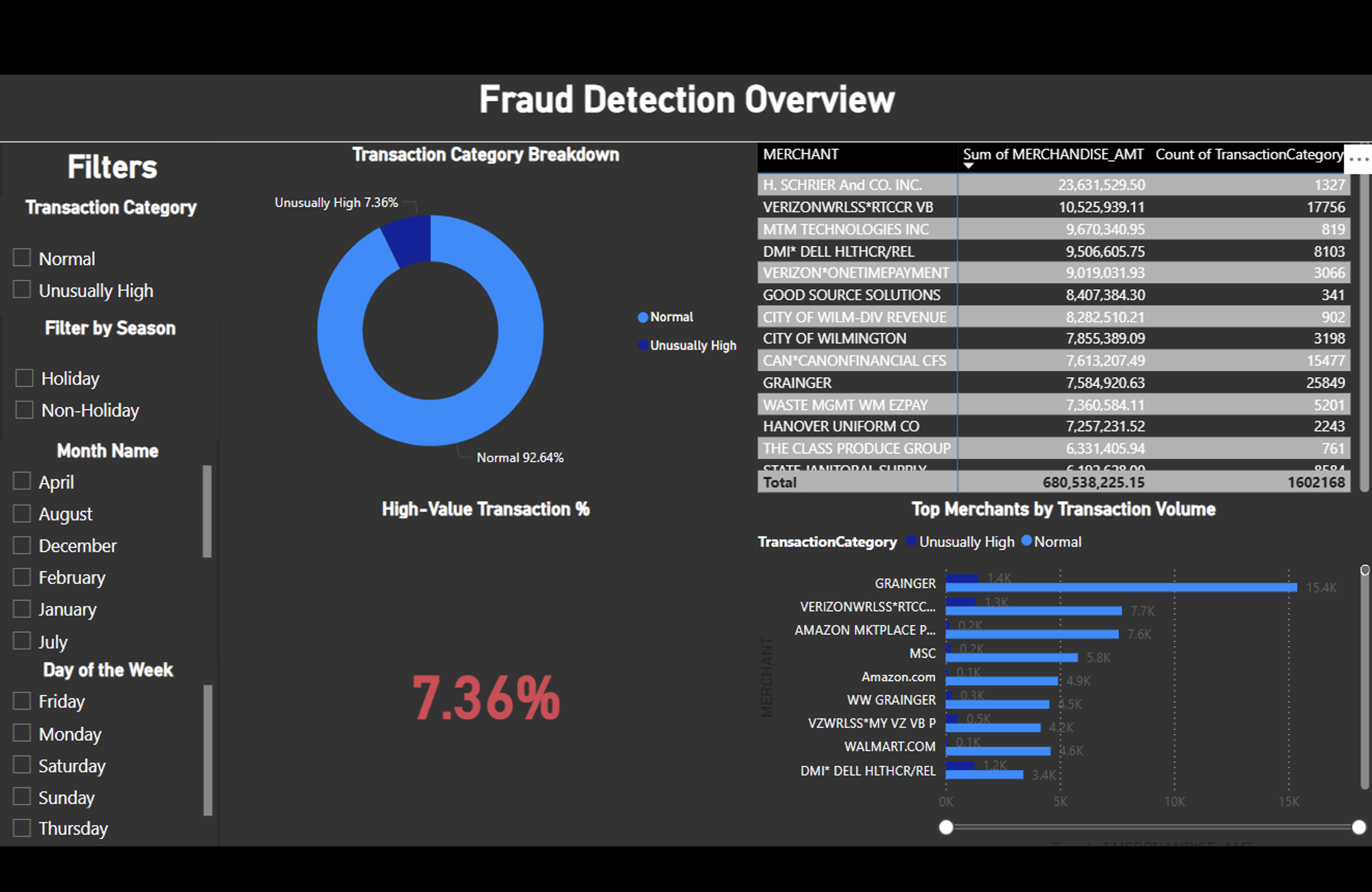
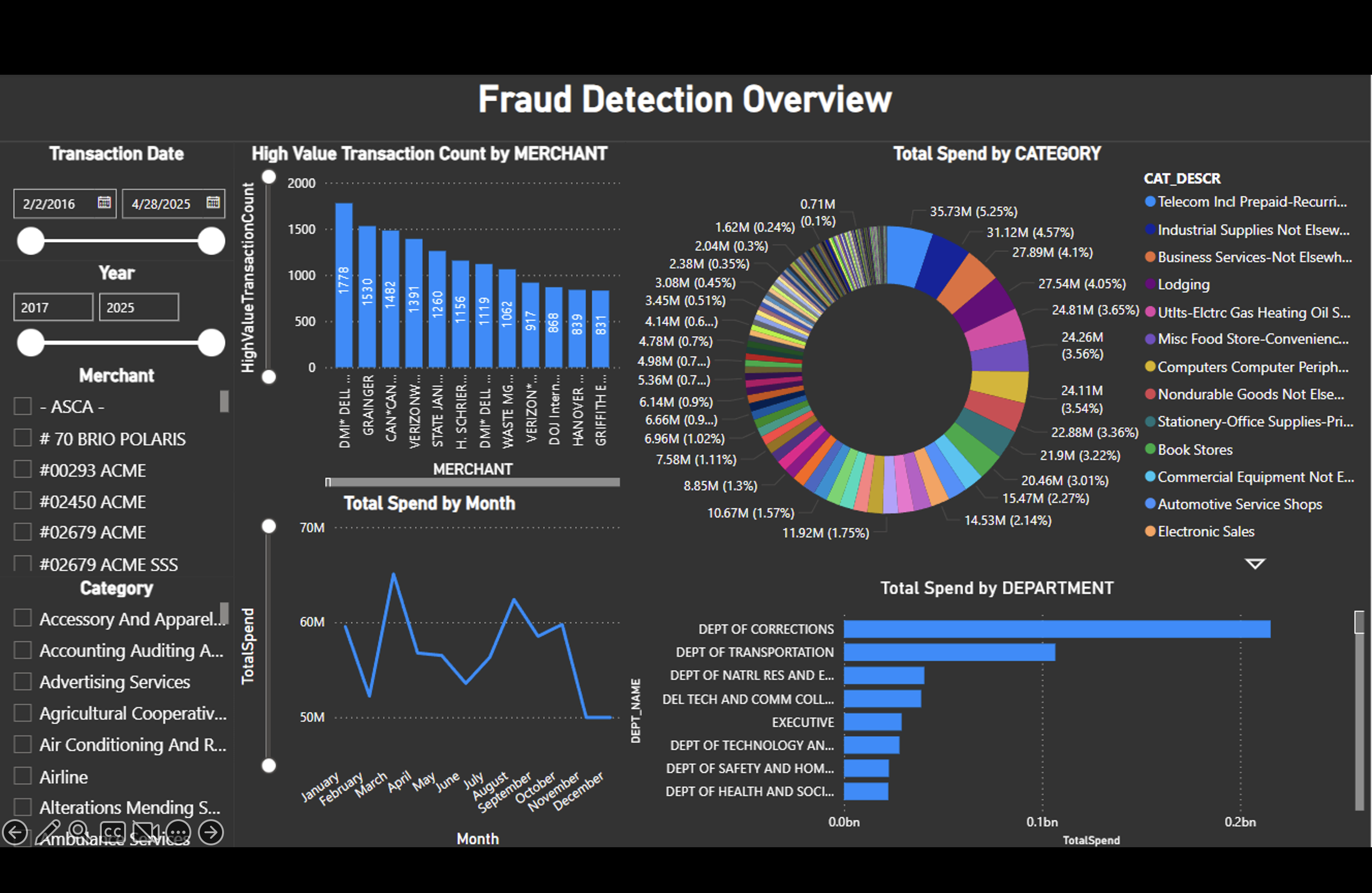
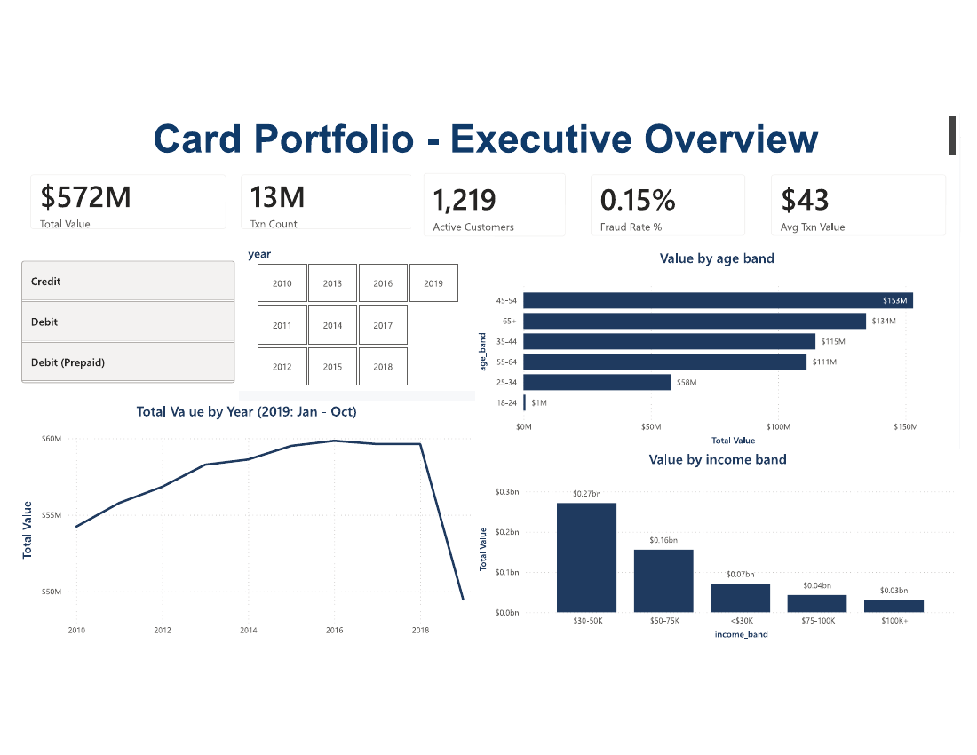
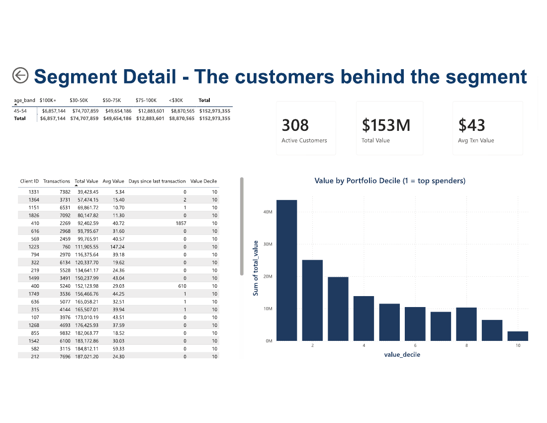
Report: the star schema is exported to Parquet and imported to Power BI — ten DAX measures across three pages: executive overview, drill-through segment detail, and fraud risk.
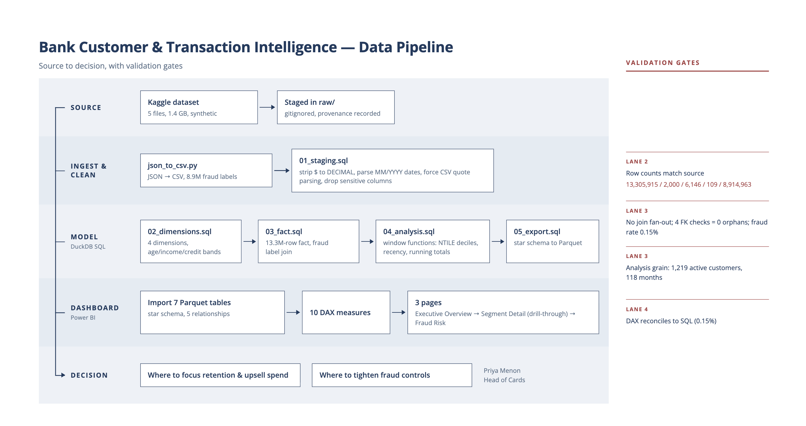
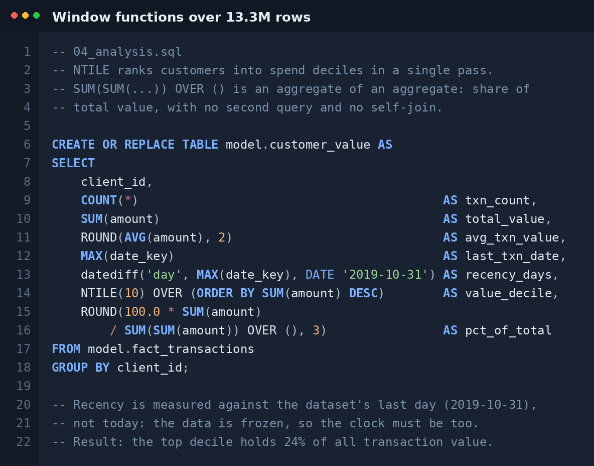
Validate — every stage proved itself before the next began
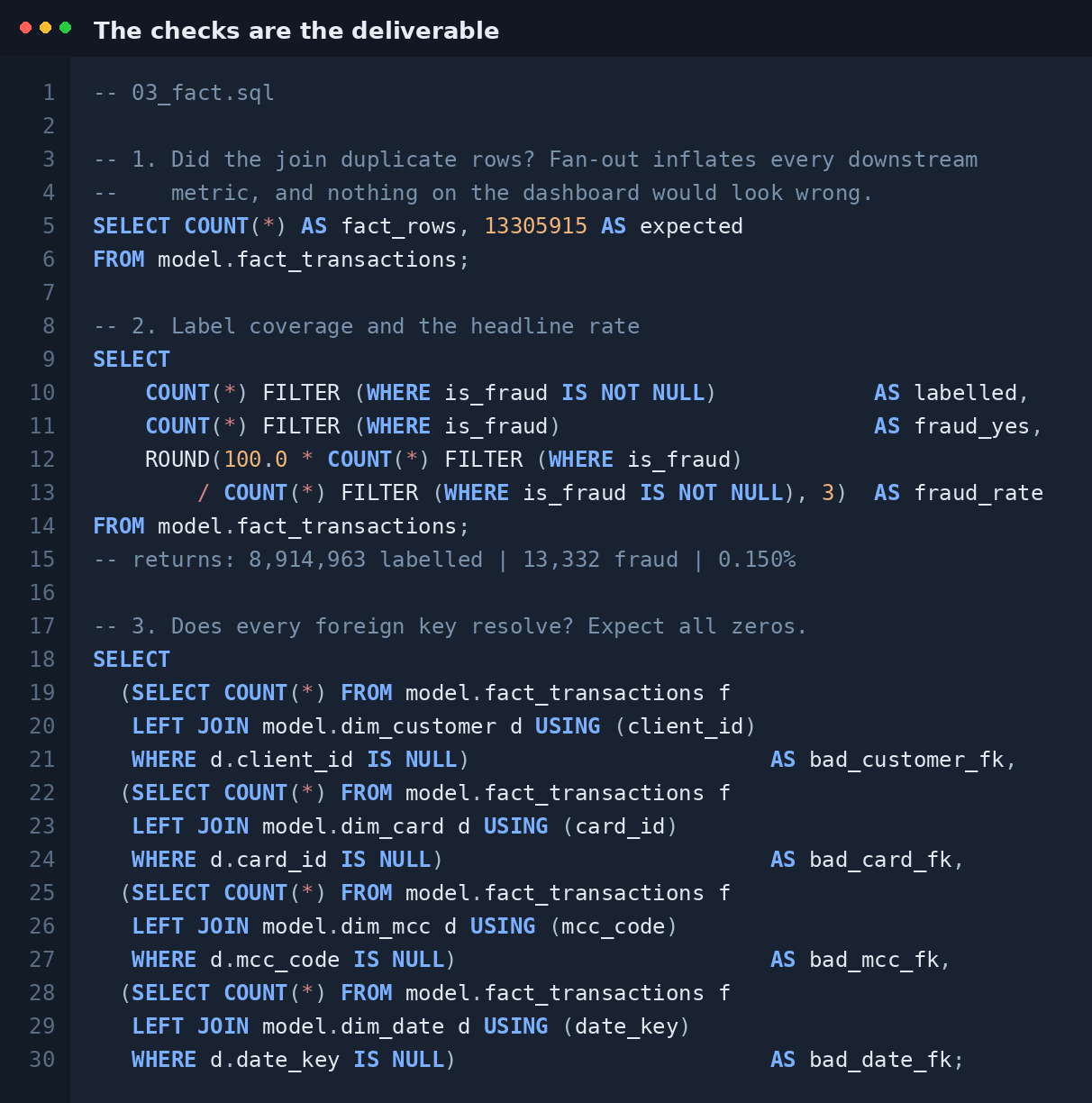
- Row counts reconciled to source after cleaning — 13,305,915 / 2,000 / 6,146 / 109 / 8,914,963.
- Fact build tested for join fan-out (row count unchanged) and referential integrity — 0 orphans across 4 foreign keys.
- Fraud rate reconciled end to end: 0.15% in SQL, 0.15% in DAX.
What the data said
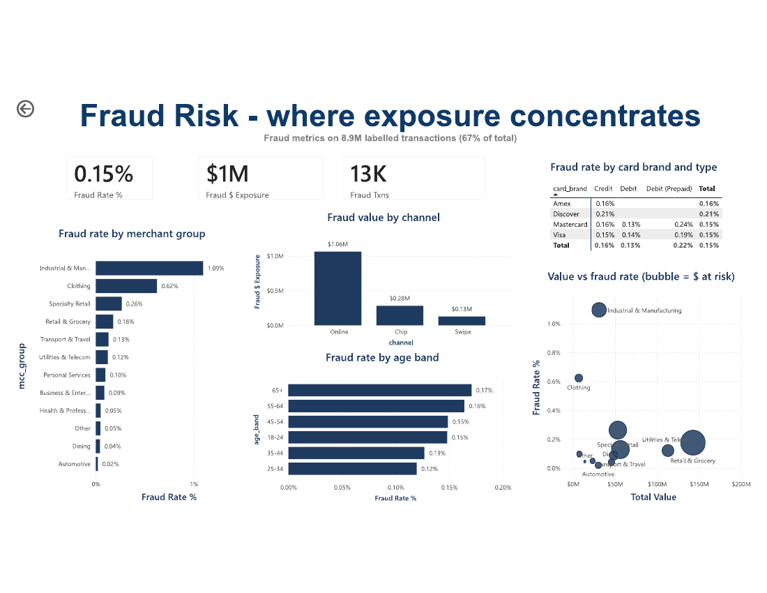
Value sits where nobody targets it
The $30–50K income band drives $270M of $572M in transaction value (47%). The $100K+ tier drives just $30M (5%). Growth spend aimed at the premium segment chases the smaller half of the book — and the top decile of cardholders holds 24% of all value, concentrated enough for retention to matter.
Fraud is a channel problem first
72% of fraud exposure ($1.06M of $1.47M) arrives through online transactions, against $0.28M on chip and $0.13M on swipe. Risk and value also sit apart: the riskiest merchant categories run 7× and 4× the portfolio average but carry almost no value — so the assumed fraud-vs-experience trade-off is weaker than expected.
The judgement call
Only 8.9M of the 13.3M transactions carried a fraud label. Treating the unlabelled remainder as legitimate would understate the fraud rate by a third and make every number look better. I modelled the flag as three-state — fraud, legitimate, unlabelled — so every fraud measure divides by labelled transactions only, and the dashboard states the coverage on the page. Getting that denominator right mattered more than any chart in the report.
What it delivers
Three decisions that were not available from raw transaction files: redirect growth spend from a tier worth 5% of value to a segment worth 47%; target fraud controls at the one channel carrying roughly three-quarters of exposure; and focus retention on the specific cardholders who carry the book. No savings figure is claimed — sizing avoided losses requires the friction cost of the control and its false-positive rate, and neither is in this data.
What's next
Quantify the revenue at risk from the added friction of online step-up authentication, and weigh it against the exposure it removes. The control is cheap; the friction is not.
Deliverables: requirements brief · data dictionary · SQL layer · star schema · 3-page dashboard · process map · insight memo · View repository →